Organizing your brand elements into a hierarchy gives you helpful constraints to communicate your main message well. By applying the same approach used in text hierarchy to your brand elements like visuals and colours, you can communicate more efficiently and effectively. Good communication and consistency leads to trust which leads to sales.
What is hierarchy?
Hierarchy is “a system or organization in which people or groups are ranked one above the other according to status or authority.” Many of us understand this concept in terms of company org charts or even Maslow’s hierarchy of needs (I also did a previous blog post about my interpretation). It is used by designers like me to communicate the right things in the right order. This is not to be confused with Brand Architecture which is how multiple brands are organized with parent companies.
Text hierarchy
When designing, I identify what the main message is and then make that message the biggest, boldest text so when people are scrolling or skimming, they can catch the main point. If they are interested in that main point, they will stop and dive deeper.

How to apply this to your brand visuals
The first thing you should ask yourself is : “What kind of message do you want to convey to catch the skimmers?” If you sell cleaning products, you may want to identify a photograph of someone using your actual products as the main message (message: our product works!). If your service is more abstract like coaching, you may want to use some illustrations to soften your message and make it more friendly (message: I can guide you from A to B). If you are an accountant, you could show some photographs of meetings taking place or you could show some illustrations of dollar bills being organized (message from photo: we are real people here for you; message from illustration: money is scary, we can soften it for you). When considering your brand style- which will you choose? Photographs? Illustrations? It is certainly possible to have photographs as the hero with some illustrations as the supplement or vice-versa but only one can be the hero and convey the main message.

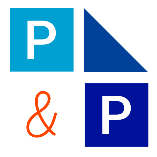
Consider the same approach with colour. I recommend having a small (maybe 3-5) palette of colours for your brand but you have to identify one as the hero that conveys the main message. For my brand, I have shades of blue to work with but the orange is really the hero. Orange is the colour of communication which is my main goal for my clients.
Make your choices then be consistent
Once you’ve decided on your main style hero, be consistent with how they are applied. The hero’s place on your website is in the hero slot- the very first thing people see when they land there. It’s ok to use some illustrations or icons to help convey supplementary points down the page but the hero space is for your main message. Likewise when you are putting together a poster or social post, the biggest and most prominent image should be in the same style as your hero. If you are using real life photos to show your products, they should be front and centre, if you have some cute illustrations that appeal to your target audience, make them big next to your text. Whatever colour you have chosen as the conveyor of your main message, use it in your headline text, your website buttons and calls to action.
Your brand is your unique combination of fonts/colours/shapes/styles and it communicates your main message even on a subconcious level. Your main visual elements like photographs, illustrations and colours are important to conveying your main message. Organize your brand elements in a hierarchy and you can communicate more efficiently and effectively. Communication and consistency leads to trust which leads to sales.
Check out how I can help your organize your brand on my website.