
A well designed social media post is the right size, directs the eye appropriately, and is on brand. There are a lot of great social posts out there and there are some really bad ones, but most are mediocre. To help take your posts from good to great, here are some graphic design principles that you can apply to your social media posts:
1. Start with size
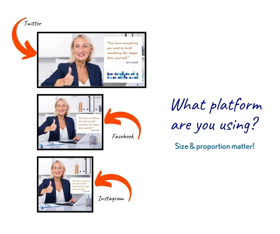
Ask yourself which social platforms you are planning to publish this post on. If you are doing multiple, like Facebook and also Instagram, you may need to make a new image for each platform. The good news is that you can start with one post, get it to where you are happy with it and then resize it. When you are choosing photos or background elements, choose some with some space around the main image so you won’t cut off important parts when resizing. You’ll then only have to move a couple of elements around before you save again.
Social media companies like to change up their sizes so you can also design using ratio (ex: 4:3 or 1:1) so the shape like landscape or square is preserved even when the exact number change.
Pro tip: Beware how your post will show up on mobile! If you put a ton of text or elements right to the edges of your post you may not be able to see it or it may get cropped on mobile.
2. Direct the eye
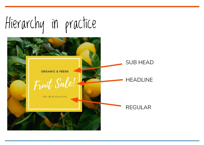
Our brains see the biggest and brightest things first. Then, if they stick around, they look for the next thing and the next. So when designing for social media we want our most important message to be the biggest/brightest. You have to decide ahead of time what that message is going to be and then design is appropriately. Is it the title of your new product or of your next event? If they stick around, what do you want your readers to see next?
This directing of the eye is a graphic design concept called hierarchy. It uses size to add contrast between elements and get our readers to read in the order we want them to. It takes practice but is a very effective design tool.
Many Canva templates have hierarchy built in and then many business owners try and cram too many words into the spots and end up washing away the hierarchy. Watch out when you are in Canva that you don’t do that.
What are you trying to say exactly? How can you get that message across in microseconds? If your reason for posting is to advertise a sale or event, make the words “FLASH SALE” or “VIRTUAL NETWORKING” the largest things on the image. Think about if your reader is aimlessly scrolling quickly through their feed, if they are going to catch 2-3 words from your post- what do you want them to be?
In addition to your main message, be sure to include all of the relevant details in your post like dates and times for events or what the next action can be for sales or quotes.
Remember that you have the spot below the image to add more text and details or you could even make the post a carousel, adding more information with every swipe.
Pro tip: Try and describe what you are trying to say out loud to a friend in 3 seconds. Whatever words come out that they understand, write them down, that’s your headline.
3. Be on brand
Now that you are directing the reader’s eye, let’s try getting into their brains. In order to gain a customer, they need to have interacted with your company a few times. Each time they see you on social media, your website, a sign, that’s a touch point. It takes 5-12 touch points to convert a stranger into a customer. If your touch points aren’t all on brand, the brain doesn’t group them all together heading towards the sale. So we want to make sure that all of your social posts are on brand.
The first thing you can do is set yourself up with some constraints. What are your brand colours? Only use those colours. Same goes for fonts. What shape is your logo? Does it have squares and triangles in it? Use those. Is it a circle? Use circles. Using your brand’s colours, fonts and shapes consistently is a way to build trust with your customers. Choose Canva templates based on your brand shape, change everything to your brands colours and fonts and you are most of the way there.
Finally, use images or illustrations but not both. It’s very hard to smush together these separate styles. I know it is tempting to use the Canva template du jour but some smart selecting will help you stay on brand and convert more strangers into customers.
Pro tip: Record the HEX # values of your brand colours, it’s the only way to be truly consistent
4. Good design = quality company
As consumers scroll through endlessly on their phones, they can easily judge posts as good design or bad design. They may not know why but they are also judging good designs as quality companies and bad or meh designs as bad or meh companies. There are a few graphic design principles that can help move your social posts from the bad or meh bucket into the good, quality one.
Good design in social media considers these graphic design principles:
- Symmetry
- Draw an imaginary line down the centre of your post, is it balanced or are there more items on one side or another? Move elements around until it is balanced and not more weight on one side or the other.
- White space
- That main message from earlier is your focal point. Leave white space around it for maximum readability. Leave a good margin around the outside.
- Contrast
- Make sure that there is adequate contrast between any of your brand colours that you’ve placed on top of each other and that your headline really stands out.
5. Add your logo, leave out the url
On social media, people are scrolling through quickly and your post is one among many. You want to make sure that your company is getting the credit it deserves when it gets the attention. Add your logo as a small water mark in the corner or the last page of a carousel. If your colour logo doesn’t doesn’t mesh with the colours in the post, try using a straight white or straight black version of your logo. If you don’t have those, make them.
Social media users cannot click on an image. They can see it, read it, watch it, but no clicks can happen. So, add the url for your website, event, product in the bio, description, or first comment and keep it off the image.
Bonus: A second set of eyes
Before you push the button to post (and we all know how satisfying that can be), have someone else read your post. I know this can be time consuming but poor communication (spelling errors, date/time errors, poor readability) erodes trust super fast and a second set of eyes can help you fix easy mistakes before they are published.
Reached your DIY ceiling?
If you’ve outgrown unsupported DIY but a full rebrand isn’t in the budget yet, the Make It Club was made for exactly where you are. The Make it Club is a done-with-you sprint where you walk away with a professional brand kit you can apply on your own from day one.