Typography (the art of designing words) is one of the hardest things to get right. Many seasoned designers, even me, can have a tough time narrowing it down let alone many small business owners who are trying to get their brands off the ground. If you are spending a ton of time in Canva and it still doesn’t feel right, your font choices may not be working for you.
Making font choices is capital H-HARD. Since the invention of digital type, there are millions of fonts with new ones being created every day. There are 2 common problems with choosing fonts for your brand. The first is matching up fonts and feelings and the second is being consistent across all of your communications like social media, website, labels, t-shirts, business cards and brochures.
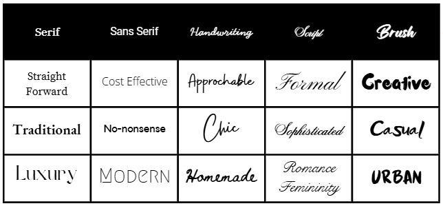
Fonts have feelings
The first thing you have to ask yourself when choosing brand fonts is “How do I want people to feel about my company”? Are you servicing corporate clients? Serif fonts are appropriate. Are you selling toys for kids? Look at some brush fonts. While you may want to pick fonts that you like, it is more important that the fonts you choose reflect how you want people to feel about your company. There is no perfect match but try and make the best match possible.
When you’ve sorted out the font – feelings match, you’ll be looking for fonts in a category that makes sense. Main categories include: serif, sans serif, script and handwriting. There are many subcategories and other classifications but at a high level, this is where to start.
Once you know what category you are looking in, then you can look for fonts that have a family. A font family will include different weights of a font like bold, italic, thin etc. If you choose a font with no way to make it bold, you may run into problems when you create things later.
As you continue to narrow down your font choices, don’t forget where you are going to use them. If you are designing in Canva a lot, start there. If you have a website, login and see what fonts your website designer has to offer. You may have to flip back and forth between Canva and your website designer to see if there are common fonts that you can use consistently in both places.
How many fonts is too many voices?
This is where things get very tricky. Not only are you looking for 1 font, in reality, you’re looking for 2-3. To help you design things easily later on, you’ll need to identify a font/weight for each of the following: Headline, Subheadline, Regular. Having this pre-defined will help you maintain hierarchy, a key graphic design principle.
Can you mix categories? Yes. Can you mix weights? Yes. The possibilities are endless which is both a blessing and a curse. There are endless combinations which may lead you to enlist the help of a graphic designer (like me!). I help business owners get a handle on all of this and give them a very usable roadmap so they can DIY later on with confidence.
Don’t know if your fonts are a problem?
The Brand Vibe Check is the best way to find out if there are problems with your fonts. It is an honest, no-fluff 30-point assessment of your current visual branding. In 48 business hours you can stop fiddling with your fonts and find out what they are saying.